It's Revolution, Not Evolution
 2002
2002
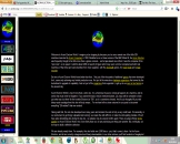 2005
2005
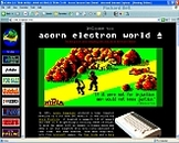 2006
2006
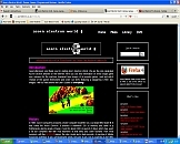 2011
2011
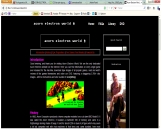 2012
2012
The Acorn Electron World web site and DVD have evolved. Those who have been with it since the very beginning will remember a grey, frame-based web site with a few paragraphs about EUG and a hand-drawn Acorn Electron logo. Then a page of links with a hideous green screen background with a bunch of hyperlinks to different games. Ultimately in about 2003 it started to look somewhat like the site you see today, albeit with frame-based navigation. In 2006, I started to rewrite the site as ASP.NET but gave this up as a bad job after a few months and this particular incarnation was never released. Hence the html-based, framed site was with us for some six years, only being junked for a Javascript-generated full screen site in 2008. At the time, this was as natural a progression as this new incarnation which is the subject of this article.
But five years later, the site has changed again. This may well be the definitive change - but technological progress is such that this by no means assured. On the site you see now, the Javascript is almost entirely gone, replaced with html5 and generated by php. If you're a regular visitor to the site, you'll probably see a slight change to the layouts of each of the libraries. Barely noticeable, but a result nevertheless of a complete overhaul of everything - and the reason why you're now very much more unlikely to click any link on the site or the DVD and find that the item you want isn't properly linked!
So why have we produced an entirely new site that looks (to all intents and purposes) almost exactly like the old one? Well, as a result of the evolution of AEW rather than, say, a developer sitting down and designing what AEW should be on paper and then programming it, the old site had quite a few limitations. If you have any interest in how modern web sites work and best practices for designing them, you'll probably recognise quite a few of these immediately. In this article I will attempt to explain all of the limitations of the old site and how for years it has held back the delivery of awesome changes.
Static Pages
A website can be static or it can be dynamic. The distinguishing feature is whether or not a user can interact with a site in any significant way (i.e. through a form or by asking for data to be presented in a particular way), and whether the site is generated dynamically from underlying data. Early websites were mostly static, and designers wrote pages, uploaded them and, well, not much else. A static site is not necessarily a bad thing. For example, hackers can neither squeeze commands into a static site to delete the underlying database nor can they reward your hard work by giving it a thumbs down or an inane comment! A static site by its very nature has 'locked down' the content. You can see the page. You can't do anything to the page. It generally loads quicker too - because operationally it's much easier to generate it.
Evolution Of Static Sites
However, when you've got more than a few pages on your site, the limitations of a static site become clear. Firstly, your site usually needs a common header, footer and navigation bar on each of its pages. You can achieve this, in a very rudimentary fashion, by copying and pasting the relevant chunks of html that display these to each file you create. The trouble is that this immediately feels like the 'wrong' approach to the issue. You find yourself wondering how you can include the same text on each page with a single line, discover that using html you unfortunately can't, and then you turn to Javascript.
Javascript Doth Not A Dynamic Site Make
Javascript is a language that allows you to fire a simple script (program) that runs in the browser of the person viewing your site. It doesn't make your site dynamic - because it cannot capture data from the user, store that data or pass that data to you. But it can do many things that regular html cannot - you simply define a function in a javascript file, and then you put an opening and closing <script> tag into your page, and any function that's between those tags will be called. Not surprisingly, the old Acorn Electron World included scripts called navbar(), header() and footer(). These scripts did little more than inject popular html to whatever page was being viewed. Success assured, it was time to generate scripts that automatically formed prof()s, pdworld()s and unreleased()s and have a nice optimsed site, right?
Well, perhaps. The trouble is that, because Javascript can be used by hackers for malicious purposes, some users prefer to turn it off in their browser before going on their journeys into cyberspace. For these users, the site appeared as a completely blank black screen. And on top of that, web browsers for the actual Acorn range (which it's probably safe to assume a few hardcore Acorn Electron fans do still use) don't support Javascript at all, meaning these users faced the same blank black screen. Browsers with Javascript enabled were also not completely free of problems. Remember those days when browsers warned you 'It looks like this site is using Javascript, which may damage your computer. Do you wish to proceed?' Quite an intimidating message for a first time visitor to the site to see, and the distinct possibility that he might click 'No' and go away rather than continue.
Suddenly that old-fashioned cut and paste method of pasting the html (which results in none of the above issues) is not looking quite so unattractive, is it?
Javascript Can't Do File Operations
Javascript also has other limitations. It cannot read the contents of a folder. For example, suppose you have 15 screenshots of a game available. Telling Javascript to loop 15 times through a function that displays a screenshot is a piece of cake, but asking it to count how many screenshots you have in a particular folder is impossible. Javascript is operating on the user's computer, which doesn't have AEW's folders to examine! How to tackle this? The answer, for AEW at least, was to basically say "Each game usually has 3 screenshots. One of the loading screen, one of the opening screen, and one of the game in action. So let's just write a function that shows links to the first three screenshots we've got." Anyone viewing the site would therefore see three screenshot links for any item in any library - even if more were available.
Search Engine Unfriendly
A buzzword in the Internet world is SEO (Search Engine Optimisation) where the theory runs that any page you add to your website should be appropriately titled, described and keyworded. That means that your html <head> should include tags with all of this information. This isn't difficult to do for a single page - but the bigger AEW became, the more pages there were to issue titles, descriptions and keywords for. Because only html files are parsed by the Search Engines for this information, you cannot put it into Javascript at all. So this bit has to be done by copying a template file, filling in a title, description and a list of keywords, and then saving it. The sheer amount of files to be generated to produce the entirety of the AEW site means that mistakes can be, and were, made just in the copying and saving alone. It's very easy to miss that you've left the keyword for 'arcadians' in the keyword section of 'boxer' when you're laboriously creating over 10,000 html files of keywords!
A World Without Google Once Existed
There were other problems with the old site too. In the very early days of the Internet, and when there was no Google, filenames were not important - or, that is, they were not nearly as important as they have become. When I was first producing the site, I was creating ".ssd" and ".dsd" files using the utility MSDOS on Windows 98 SE and it allowed for a filename of just eleven characters. Hence I devised a naming convention of a prefix, a dash, a four letter game title description, and then a letter a-z to indicate the chronological number. So, for example, the first screenshot of the game Circus Games by Tynesoft was "s-circa.gif", the cover scan was "lc-circ.jpg" and the thumbnail versions were respectively "n-circa.gif" and "sc-circ.jpg". Instructions, in the fullness of time, were "i-circ.html" and reviews "r-circ.html".
The trouble is that these filenames, which were of course, tighly ingrained in the web site on every page, and in every function, mean very little at all to the robots collecting information for Google. Hence, users doing an image search on Google for Circus Games wouldn't find them. If only they were named "Circus_Games-000.gif" - this would be an exact match. But how on earth could I ever begin to start changing them, when the references to the 'circ' version were almost everywhere? Don't forget that there are links across the whole of the site to aid navigation. Articles describing games by Tynesoft, for example, were linked to "i-circ.html", letters from EUG members were linked to "r-circ.html" and all screenshots were "n-circa.gif" or "n-circb.gif".
Html Headaches
Yet more challenges were in the html itself. When html was in its infancy, nobody really cared, or taught much, about the order of tags. So for a bold, italicised piece of text, you might write <b><i>Bold and italicised</b></i>. Whilst it works, and your text appears as you intend, the switching of the order of the two closing html tags at the end is now considered deplorable practice. Whilst everyone is promoting html5 at the moment, ten years ago it was xhtml (extensible html) that was gathering ground. Xml allows you to pass data around the Internet as a series of fields, and extensible html allows you to pass around html files as a series of fields. But the parsers that decrypt these files need the tags to be opened and closed in the same order or else they get hopelessly confused and render a load of rubbish. So if you fed "<b><i>Bold and italicised</b></i>" into an xml validator, it would fail, although "<b><i>Bold and italicised</i></b>" would not.
When Is A Game Title Not A Game Title?
Other challenges thrown up were from the titles of games themselves. Similarly to tag order, no conventions existed for how to write the title of a game in a piece of html text when the AEW site was started. I decided they would be bold and capitalised, so <B>BOXER</B> would be used to designate that I was discussing the game Boxer (and not a boxer). (Did you notice that the tag there was capitalisd too? Incredibly, the book I read to learn html taught tags should all be written in capitals! So the very early files, like the EUG articles, were littered with markup in capitals. Again, this is now considered an incredibly bad practice.)
The trouble with marking up a game title with a tag, instead of for example, giving it a style, is that you surrender how that text is rendered to the browser rendering it. Now with the bold tag this may not really matter, in the grand scheme of things, but I had also taken the decision to mark up only Electron items in this way. If I paid passing mention to a game on another format, I didn't put it in capitals or in bold. This looked weird in itself, but, as Acorn Electron had evolved, and had introduced hardware expansions and ROM chips, I'd carried this decision to only mark up Electron items through, so the Jafa Mode 7 Display Unit became the <b>MODE 7 DISPLAY UNIT</b>. The capital letters now broke the flow of any narrative; if you had a number of items being discussed in a sentence, the screen seemed to be practically screaming their names in your face.
In my naivety when producing html, and even right up until only a few years ago when html5 really started driving it home that we should make it clear in our markup when text was to be placed 'aside' or when areas where tools to 'nav'igate, I just dropped elements into pages willy-nilly.
Catalogue Pages
Quite apart from all of these issues in relation to the articles, instructions and reviews across the site, what of the catalogues themselves. These catalogues are of course the very heart of how users find the game they need, and/or discover new additions. You might have been forgiven for thinking, in relation to the catalogues on the old site, that something clever must be going on in order to inform you of what compilations any particular game was released upon, and to generate the links to articles of interest. You might have thought this, but actually you would've been wrong. Every single page on the whole site was static. Do you know how all of those cross-library links were actually added? Why, by me just methodically going through each of the tape and disc compilations I have and adding in the links manually. Yes, manually...! And the same procedure for Compatibility Information, Release Dates, Authors, EU reviews, A&B reviews and instructions. No pages could do any communication with each other at all - so I had to copy/paste any information I wanted to show on more than one page to the other pages. Just imagine how much time I must have spent, simply cutting and pasting the authors of games from the catalogue pages to the instruction pages, for example. Hours? Weeks? Months? It doesn't bear thinking about.
An Ever-Increasing Weight
And so there you had the Acorn Electron World web site - a collection of static pages that all worked very well, but of which the upkeep had become something that felt like something out of the Dark Ages, where:
- every file, without exception, had a filename meaningless to the Search Engines,
- the markup was littered with errors and had been produced completely manually,
- the data on the page itself only existed in the page itself,
- the pages had tags in the wrong order meaning they rarely validated correctly against validation tools,
- the pages could splash warnings about Javascript at users with older web browsers, and
- the pages didn't work at all if your web browser didn't support Javascript or had it turned off.
Doesn't sound too great, does it?
Now don't get me wrong, clearly the site was still a gorgeous repository of everything that you could ever want to know about the target machine. But, as a direct result of this 'old' infrastructure powering it, it was difficult to scale it up.
Hence Why There's No Images
When I started the site, for example, no-one really cared about preserving inlays of software. The small 150 x 224 thumbnail image of a game was considered descriptive enough for someone to identify it, and also web pages took a long time to load. Big images were frowned upon because they weren't really necessary. Remember, when AEW started, it was the era where you could probably fit a maximum of three biggish images on a regular floppy disc!
But now the Internet moves at turbo-speed, suddenly people want to know why Acorn Electron World doesn't have full-size scans of each inlay and, for example, of each instruction leaflet. Well, the answer was, because to add a link for a full-size scan to cover art would have meant adding an additional link to every single static page on the whole site!
And Thence Why The Change
 Dragon 32 Universe
And now let's really take the argument to the next level. For, very recently, I decided to create a wholly new site for the Dragon 32 called Dragon 32 Universe. This is exactly the same type of archive site as Acorn Electron World is. Just like AEW it has libraries, instructions, reviews, downloads and links. It also has a fully-working shop, Paypal API integration and full size scans of everything for the Dragon 32 that I have collected. It took about six months to get it going to its current (high) standard, and, with all of the above knowledge safely in my head, Dragon 32 Universe was programmed with full filenames, html5 throughout, full size scans, no Javascript and full SEO throughout. Its images appear in number one position if someone does an image search on the title of any Dragon game. It was number three in Google within two weeks. This brand new Dragon site ranks higher than the Dragon Archive, which has been going 10 years and has what you would consider an inherently higher Google 'reputation'. But the Dragon Archive is very much like the old AEW, and undoubtedly has exactly the same issues in relation to its content. And this is the rub. If you don't grasp hold of the issues that affect your website - if you don't take the time to iron out all the creases that have appeared as technology has moved on - then someone else will, and, free of the constraints of the 'old' ways of creating, will create something better, and take your site's audience.
So You Need Dynamic Sites Now Then, Right?
So, you might wonder, does that mean Dragon 32 Universe is not a static site? No, not at all. The shop clearly needs lots of user interaction, because it needs to know when a user adds items to a shopping cart, removes them and buys them. But other than that, Dragon 32 Universe is just as static as Acorn Electron World.
The difference is that Dragon 32 Universe's static pages are generated from PHP code which in turn accesses database information. You won't find that PHP code or database on the site itself - you'll find it on my laptop in the form of scripts that I run when I make a change. With one or two clicks, however, the SEO information can be altered across every single page. As can the way the instructions or the reviews appear, and the links to them. An infinite number of links can be made across the data in the database tables, to produce pages which adhere to a particular template; an operation that can achieve in a day what would haven taken three months or so with the old Acorn Electron world site. This is, in actual fact, the best of both worlds - creating your static site from dynamically held data.
The result - your site remains a collection of pages which load quickly, are immune from attacks on the database powering them (because there is no database powering them!) and works on every machine because of the lack of Javascript. The site looks the same but is actually optimised so that it is 100% times more accessible.
Bring Me To Life
When Dragon 32 Universe was finished and working, it was only natural that the time to bring Acorn Electron World up to the same standard would have arrived. But the scale of the project - i.e. getting AEW to work in that way would mean having to extract all of the data needed from static pages, and then write scripts to regenerate it all, all over again.
This article has hopefully demonstrated the sheer scale of the challenge that lay before me at this point. The process of extracting the data alone, if done manually, would have taken months if not years. In the next article I will explain how I managed to do it, how long it took and how I used object-oriented programming to bring it all to life, hopefully saving a lot of time both now, and for future development. The site now is a revolution, not an evolution of the site it was. Over the next few months, on the site itself, you'll see just how the extraction of the data is made to power up reams of new features, as unlimited as your imagination. Onwards and upwards...!